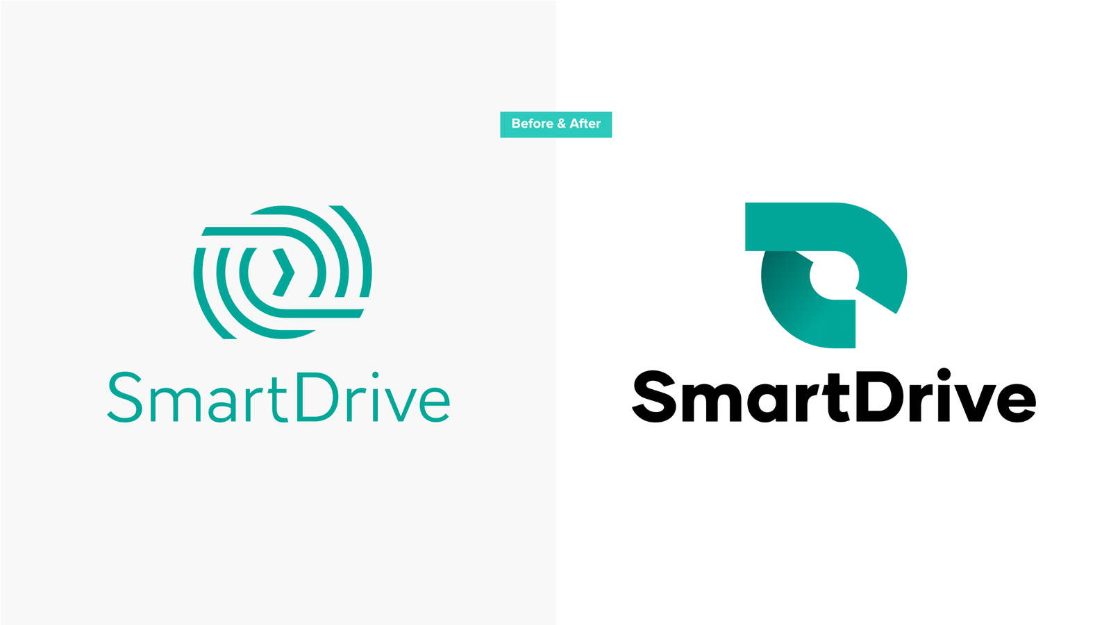
2020年10月1日より、スマートドライブのロゴが新しく生まれ変わりました。本日はCDO(チーフ デザイン オフィサー)のガナー ロックウッドが、ロゴを変更した背景や、新ロゴに込めた想いなどを紹介します。
(See English version below)
はじまり
2013年の冬、当時まだ大学院生だった代表の北川とは友人(斉藤さん)の紹介で知り合いました。私は当時フリーランスのデザイナーとして働いており、スマートドライブにも業務委託として関わったのが最初です。その時北川がシェアしてくれた事業資料には、ドライバーの運転に対してポジティブなフィードバックを用いることで安全運転を促進し、そのサイクルがまわっていくことで交通事故や渋滞を削減していくという構想が描かれていました。
このアプローチであれば、人類のカーボンフットプリントを減らして地球環境を改善し、同時に人命も救っていくことができるかもしれないと思ってワクワクしたのを覚えています。
斉藤さんと私が手掛けた最初のプロジェクトは、会社のロゴやブランドの立ち上げとホームページの制作でした。最初にロゴを考案するにあたって、まずは会社のアイデンティティについて考えるところから始めていきました。斉藤さんはプロジェクトの途中で他社(IDEO)からオファーがあり、社員としてそちらで働くことになったためにプロジェクトからは離れ、私が引継いでロゴ制作を進めていきました。
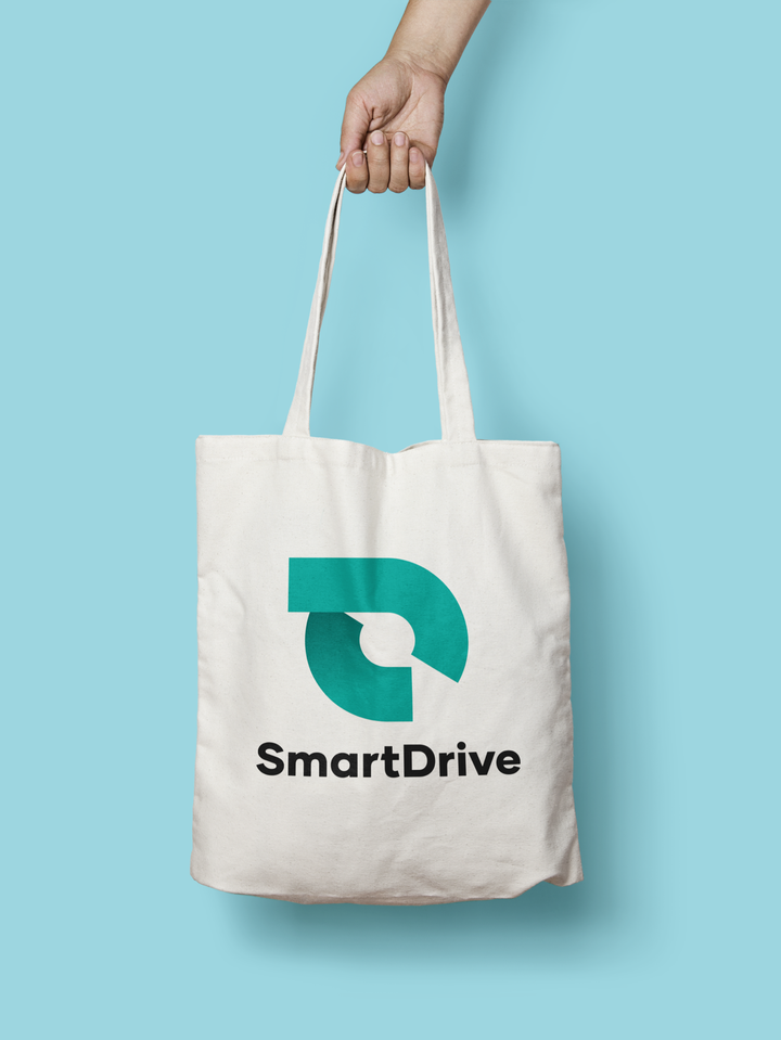
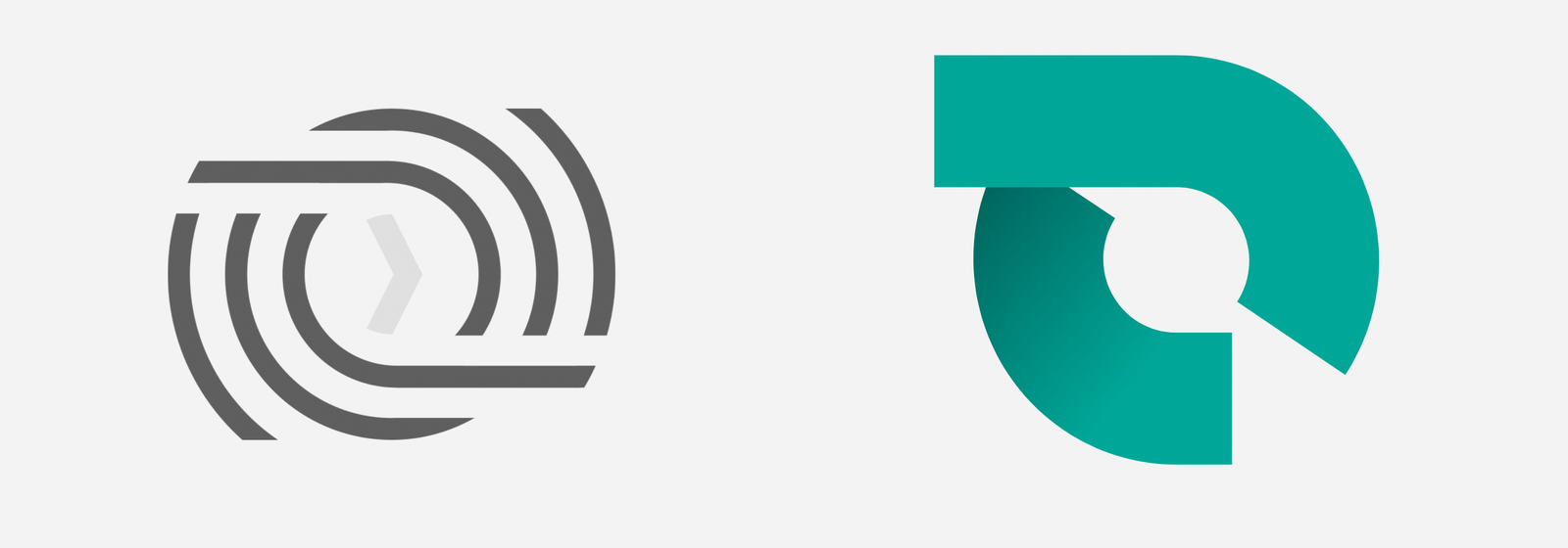
以下が最終的に出来上がったロゴですが、ポジティブなフィードバックのサイクルが周りながら前進していく力をイメージしたものです。
それまで私は10年以上もフリーランスとして働いていましたが、その後も継続してフリーランスとして活動し続けていくつもりでした。一方で、スマートドライブでの仕事に携わっていく中で、北川のビジョンや能力を理解していくにつれ、自分が関わってきたクライアント企業の中でも特に魅力を感じる企業になりました。また、会社のブランディングやデザインは、スマートドライブの事業の性質にもしっかりマッチしたものにならなければいけないと考えていました。
会社の成長と環境の変化
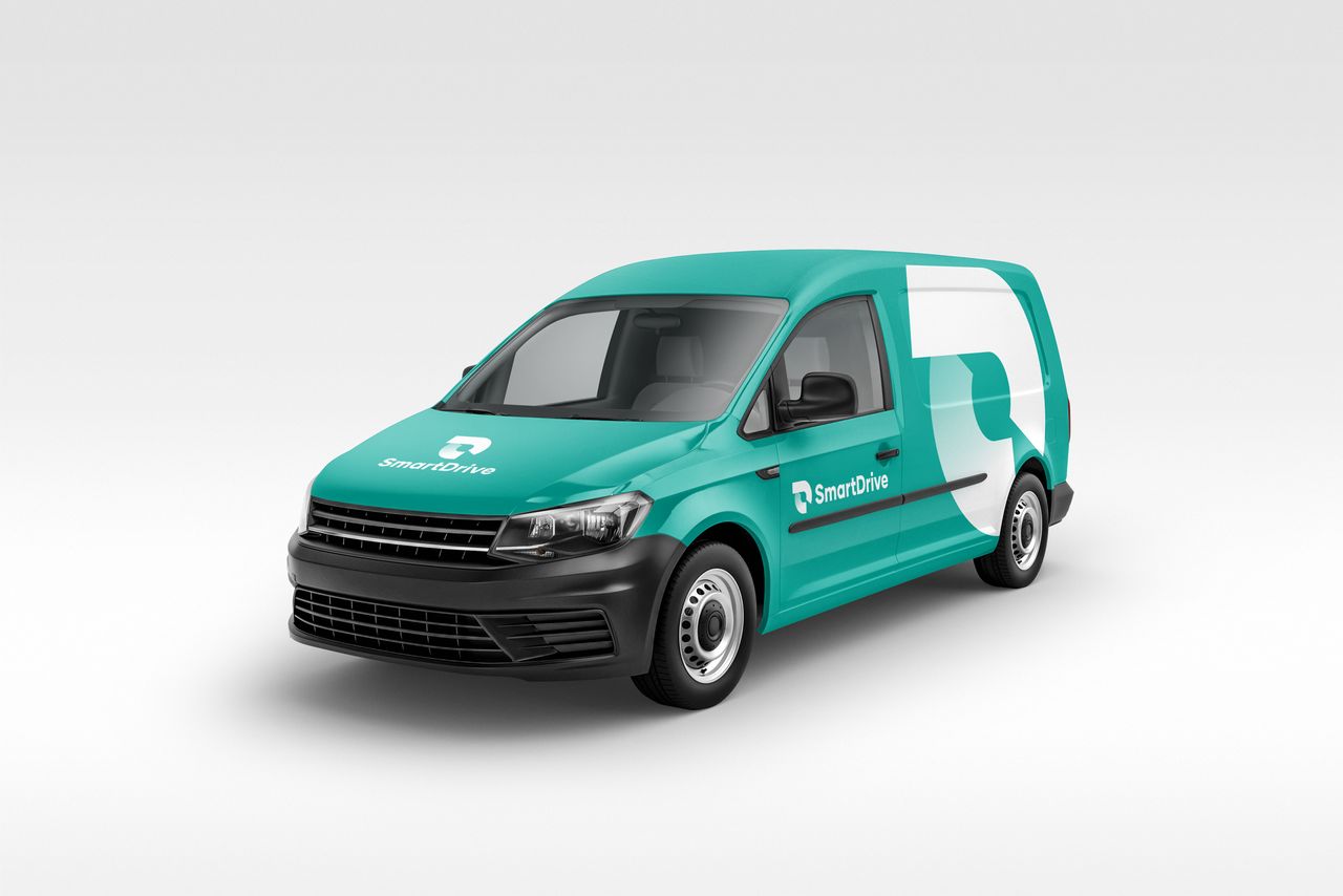
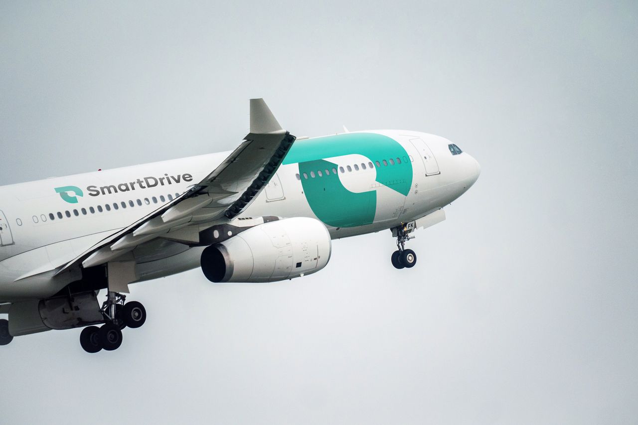
当時の本郷オフィスで生まれたスマートドライブロゴは、これまで特に問題なくロゴとしての役割を果たしてくれていました。一方で、会社が成長しメディアなどにも頻繁に露出するようになってくると、他社ロゴと並べられたり、多種多様な会社ロゴとのクラスター状態の中で表示されるようなケースが増えていきました。
スマートドライブのロゴそのものは、そもそもやや控えめのビジュアルにつくっていた関係上、多くの他社ロゴと並べられて相対的に見られると、視覚的なインパクトが霞んでしまっていることに気づきました。
また、弊社がモビリティデータプラットフォームを擁する先進企業として、大企業のクライアントやパートナー、そして政府などと一緒に、世の中のDX (Digital Transformation) を推進したり、人々の生活をより豊にしていくためのデータ利活用に携われるようなステージになったということもあり、改めて会社の事業やミッションをしっかりと対外的にもコミュニケートしていく必要があると考えました。
会社の変遷に寄り添う
他社のロゴの中に紛れてもはっきりと認識できるようにするためには何を変えるべきかと考えた時に、最初は単純に、ロゴそのものの構成はいじらずに、線を太くして目立たせるというアプローチを取りました。ただ、元々の会社のビジョンの表現をキープしつつ、かつ会社の現状のステージをふまえて正確に表現するためには、線や文字を太くするだけでは不十分だと考えるに至りました。
今回改めて考慮したのは、モビリティデータの流れや、今後のデータの拡張性、そして弊社が取得し解析しているデータのみならず、世の中にある多種多様で異なるレイヤーからくるデータとの連携、そして弊社のモビリティデータプラットフォームが社会基盤になっていくというビジョンと価値を表現する必要がありました。
ポジティブなフィードバックを使うアプローチでドライバーの安全性を高めていくという元々のビジョンを踏襲しつつ、その土台の上で成長している様々な事業が今後さらに成長していく過程でも、それをしっかり表現しバックアップできるような抽象性を持つロゴにしたいと考えました。
ソリューション
私たちは一旦元々のコンセプトである「ポジティブなフィードバックのサイクルが回りながら前進していく」に立ち返って、そこにさらなる深みを加えるということをしました。
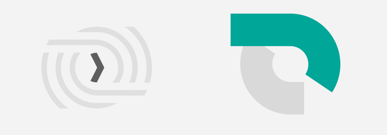
以前のロゴでは、中央の矢印マークが前に進む動きを表現していましたが、新しいロゴでは上側のラインの左端に伸びる直線を使って前進する動きを表現しています。
上側のラインと下側のラインが重なる部分にはシャドーが加わえることで立体感が付与され、以前のロゴでは幾重にも重なっていた曲線はシンプルで力強い2本に集約されました。
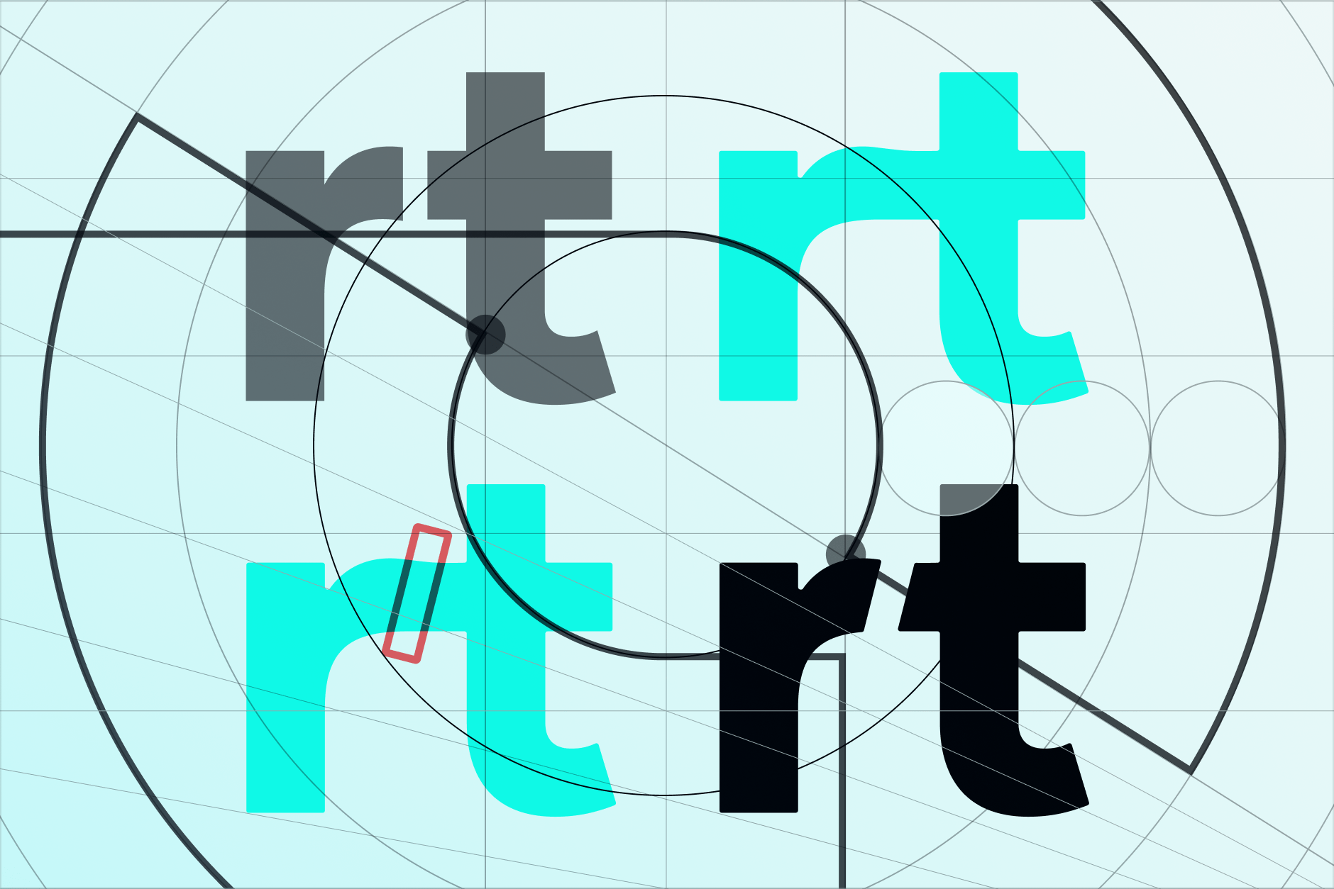
以前のロゴにもあった小文字の “r”と”t”の間のスペースについては、新しいロゴにおいても踏襲し、ロゴが小さく表示される際にも見やすいようにしています。
最後に
私たちはこれまでに会社ロゴやサービスに使用するロゴのために120個以上のロゴファイルをつくってきました。これらのロゴは様々な用途や色、ファイルフォーマットに対応していますが、社内用に実に456個ものファイルが用意されており、より多くの用途や一般的ではないファイルフォーマットにも対応できるようになっています。
ファイルをご覧になりたい方はこちらをどうぞ
https://app.box.com/s/x5452inhtp1vcctqwia049jf6ectx7d4
今回のロゴのアップデートは非常にうまくいったのではないかと感じています。
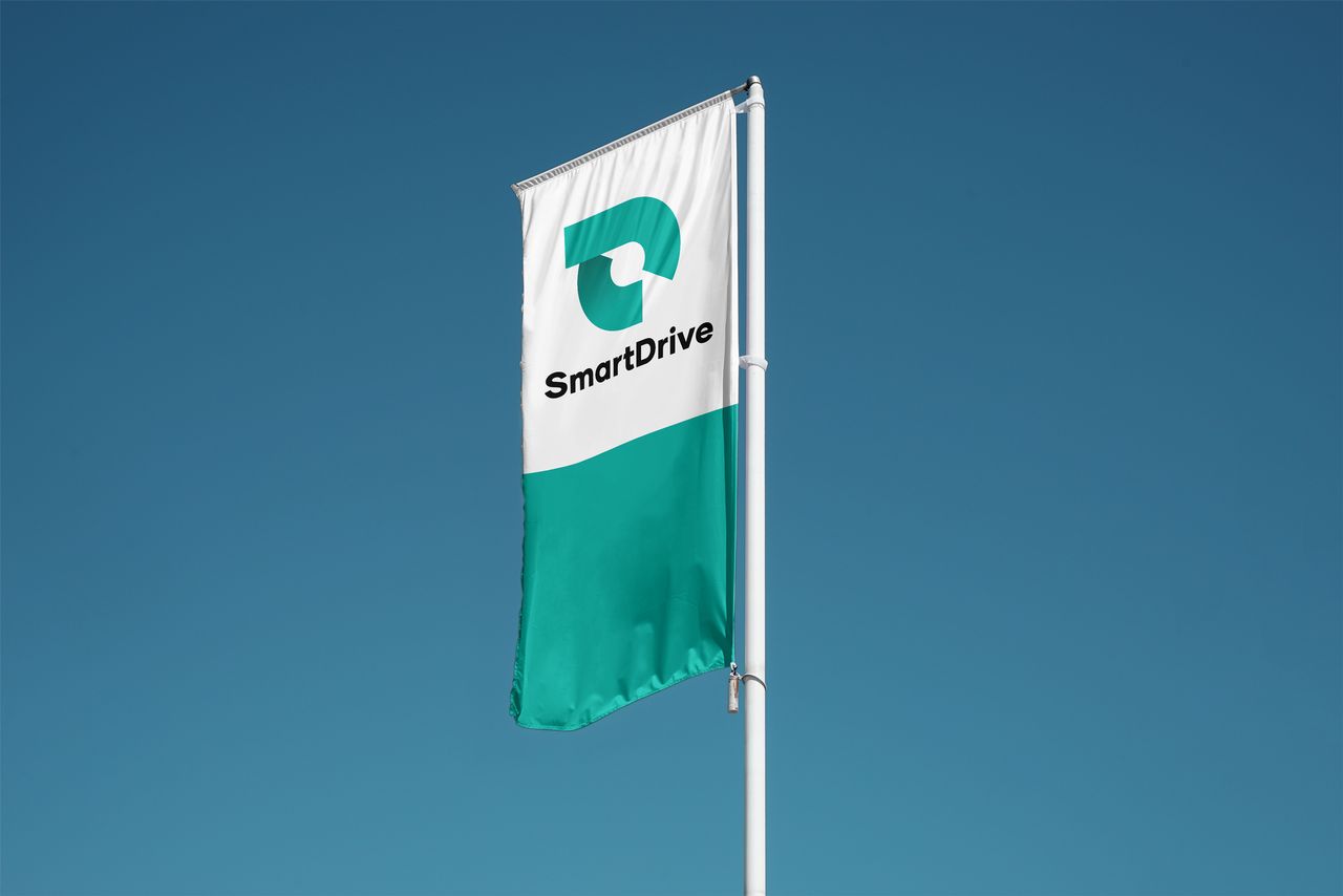
みなさんに弊社の新ロゴや事業の発展を、メディアなど様々なシーンで見かけていただけるように会社一丸となって精進していきますので、引き続きご支援のほどよろしくお願い致します。
(English version)
History
In the winter of 2013, my friend Shoko Saito introduced me to a Tokyo University student named Retsu Kitagawa who had a big idea to help reduce traffic accidents and congestion by using positive feedback to encourage safer driving. He showed us a pitch deck that outlined the business plan, which was obviously going to be the foundation for a huge amount of interesting work that could genuinely help people and even potentially save some lives, all while reducing carbon footprints.
We began working on several aspects of the identity, and shortly thereafter Shoko accepted an offer to work for IDEO in Tokyo. When it came time to create the final logo, the brief called for imagery that would support the idea of a positive feedback loop that progresses forward. This is where we took that idea.
I’d been working freelance for more than a decade and intended to keep working that way. But Kitagawa-san quickly became my favorite client for his clarity of purpose and ability to grasp and unify a large number of complex inputs. I knew that the branding and all design output needed to match these traits as closely as possible.
Changing Circumstances
In many ways, the SmartDrive logo that was born in that Hongosanchome apartment has served us well. As the company grew, the logo was increasingly called upon to be displayed in large groups of other logos, in a grid or cluster. In those cases, SmartDrive’s logo often felt like it wasn’t as visually impactful as it needed to be. Its understated nature became a drawback. At the same time, we needed to communicate the idea that the company had grown from a startup that was taking small but meaningful steps to an organization with a mobility data platform that’s ready to help enterprises, governments, and other partners to use their data to improve people’s lives in tangible ways.
Supporting Change
The starting point in our conversation about change was the idea of boldness. We looked at only thicknening the text but leaving the mark untouched or thickening both mark and text. Finally, we explored options that took the basic concept from the original brief and expanded on it. What we found was that a simple change in thickness wasn’t enough. We had to go the second route.
Topics of discussion included things like data streams, expansion, connections, our existing cycles of improvement, a new forward motion, and information strata among other concepts.
The new goal was not to create something that literally signified all aspects of the brand, as if checking off items on a list. Instead we wanted to create a solid jumping off point for telling our story. We needed to keep the basic ideas and blend in the new ones, building at a level of abstraction that would enable us to tell a story that’s open enough to grow as we grow.
Solution
We went back to the original brief and expanded on it, keeping the idea of the positive feedback loop and forward motion, adding some depth.
The old logo used an arrow symbol to talk about motion, while the new logo uses a trailing line to show the result of motion.
The loop gains depth and removes unnecessary complexity.
We even kept a small detail in the letter forms that opens the space between the lowercase “r” and “t”, aiding in legibility when the logo is displayed at smaller sizes.
We’re making available 120 logo files for the corporate logo and all our services. Those files cover a lot of different uses, color spaces, and file formats. Internally, we have 456 files that cover even more use cases and exotic file formats.
We’re really pleased with the results and we hope you’ll enjoy seeing us around.
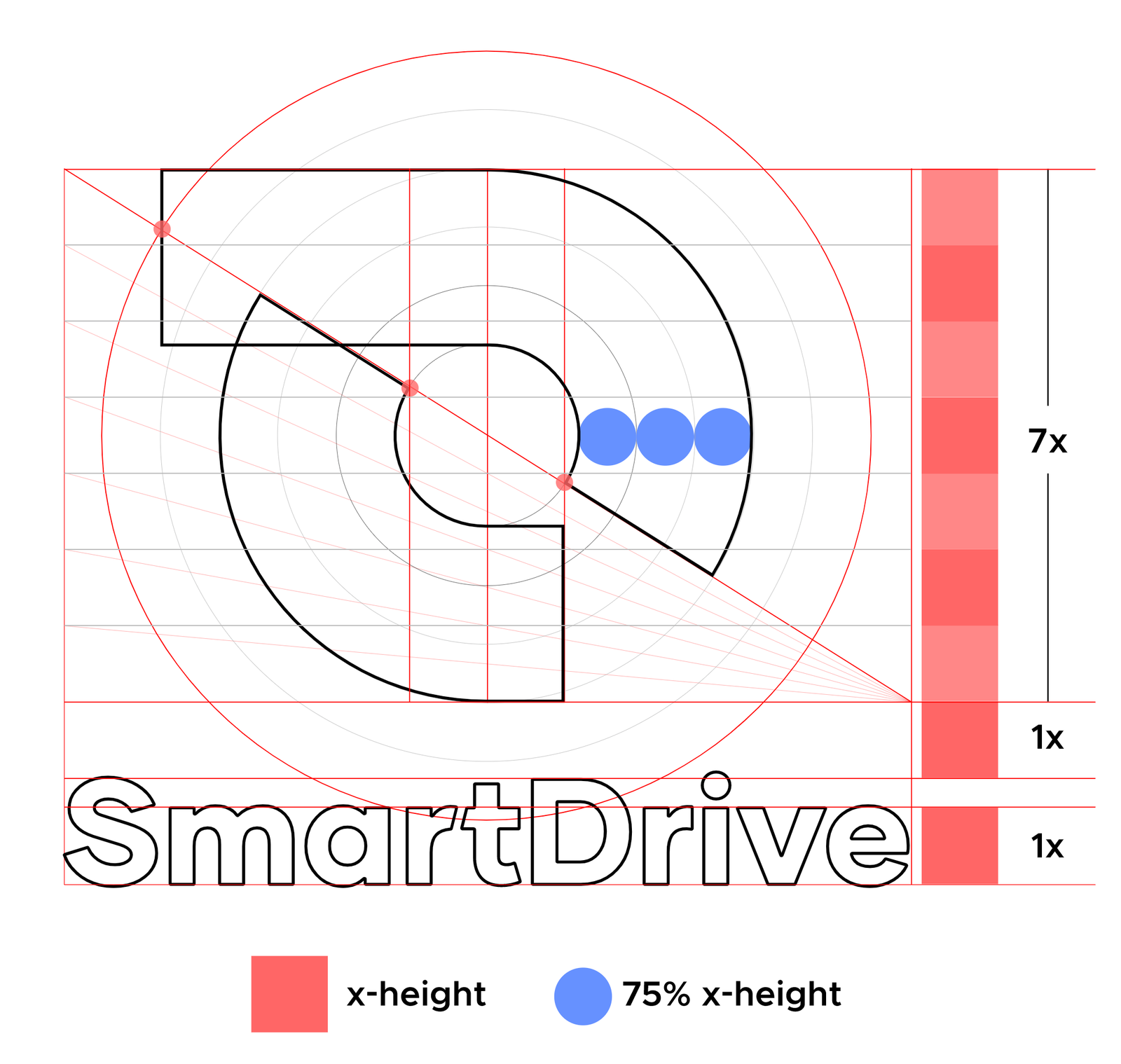

 上側のラインと下側のラインが重なる部分にはシャドーが加わえることで立体感が付与され、以前のロゴでは幾重にも重なっていた曲線はシンプルで力強い2本に集約されました。
 以前のロゴにもあった小文字の “r”と”t”の間のスペースについては、新しいロゴにおいても踏襲し、ロゴが小さく表示される際にも見やすいようにしています。